One variable often overlooked that causes fluctuation in Month over Month analysis in Web Analytics data (and I suppose other sets of data) is days in the month. February is a prime example where you go from 31 days in January to only 28 in February (except leap years) resulting in an apparent 9.7% loss in traffic.
Below is a chart of assuming steady traffic, meaning the exact same amount of traffic every day for the entire year. See how wildly it swings purely due to the number of days in the month? This is important to keep in mind if you are using M/M analytics.
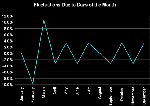
Use the below numbers as a reference to better understand the month-by-month day count analytics bias to help you better explain your monthly reports:
- January: 0.00%
- February: 9.68% loss (6.45% loss during leap year)
- March: 10.71% gain (6.90% gain during leap year)
- April: 3.23% loss
- May: 3.33% gain
- June: 3.23% loss
- July: 3.33% gain
- August: 0.00%
- September: 3.23% loss
- October: 3.33% gain
- November: 3.23% loss
- December: 3.33% gain
One other variable that may be overlooked is the line-up of days in the month. For some this may be the number of weekends in the month, for others it may be the number of Mondays.